

Weather Maps
Redesigning one of The Weather Network’s most used products for clarity, consistency, and cross-platform harmony

My Role
Responsible for User Research, UI Design, User Feedback analysis
Team
I was the solo designer on this project, collaborating with a Product Manager, and 2 Front-end developers
Timeline
10 Months
Overview
You check the weather on your phone, then open your laptop, and suddenly, everything feels off. The layout changes. Controls are different. Features you expected are just… missing. That was the everyday reality for users of The Weather Network’s Weather Maps. Despite being one of TWN’s most-used tools, the product ran on three separate, outdated codebases.
Over the years, each platform, web, iOS, Android, had drifted into its own version of Weather Maps, making even small updates hard to manage and the user experience frustratingly inconsistent. The interface hadn’t evolved in over a decade, and cluttered terrain style maps often made key weather data like radar hard to read.
So when TWN began transitioning to a new React platform and refreshed design language, this became more than a visual overhaul. It was a chance to rebuild Weather Maps from the ground up. I joined the team as the only cross-platform designer, tasked with rethinking how millions of users interact with live weather and how we could make that experience simpler, faster, and easier to maintain.
Case Study At a Glance
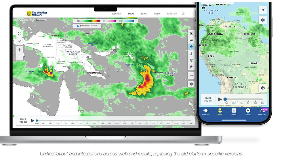
Unifying the Weather Experience Across Devices
Problems
-
The maps experience looked and behaved differently across web, iOS, and Android, which made it confusing for users and hard to keep aligned.
-
Supporting three separate codebases made even small fixes or updates slow, inconsistent, and difficult to maintain.
-
Users were frustrated by missing features and dated visuals, especially compared to the cleaner, more complete tools offered by competitors.
Solutions
-
We redesigned Weather Maps as a single, responsive product that worked consistently across platforms, replacing the old fragmented versions.
-
Key interactions like the timeline and layer controls were reworked to be simpler, more usable, and better suited to smaller screens.
-
I created flexible components and design patterns that scaled across breakpoints and were documented for reuse in other weather tools.
Results
🎉
Weather Maps became TWN’s #2 most-used product, climbing from its previous spot in the #5–6 range.
🎉
The new patterns and layout structure were reused by other teams and rolled into the company’s evolving design system.
🎉
The project also helped spark the formation of a dedicated user research and testing team to support future design decisions.
Goals
The Weather Maps redesign aimed to bring consistency across all platforms while laying the groundwork for better usability and future updates. We wanted the product to feel unified, modern, and more aligned with what users actually expected from a weather experience.
Unify the experience across platforms
Instead of treating maps on web, iOS, and Android like separate products, we wanted to build a unified cross-platform version that worked everywhere and one that teams could actually maintain and keep improving.
Catch Up to Industry Expectations
We knew we were starting to fall behind on what users had come to expect from a modern weather experience, and this was a chance to catch up.
Align with the new design language
The company had started testing and slowly introducing new branding and components, and this redesign was meant to help bring that direction into one of its most-used products.

Context
When Platform Consistency Breaks Down
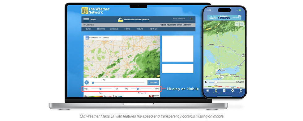
The maps hadn’t seen a proper redesign in over a decade… and it showed. The interface felt dated, and features were wildly inconsistent across platforms. Even between web and Android, it looked and behaved like two entirely different products. Some features existed on one platform and not the others: speed and opacity controls only appeared on desktop; highway conditions were available on web and Android, but completely missing on iOS.
There was no single source of truth. Just three slowly diverging versions of a product millions
relied on.
Putting the New Design System to the Test
And if all that wasn’t enough, this redesign came with extra weight. Weather Maps wasn’t just getting a visual update but it was the first major TWN product to be rebuilt using the new React platform and design language. Smaller projects like Climate and Vacation had tested the waters, but Maps was different. It was high-traffic, high-visibility, and a litmus test for whether TWN’s design direction could hold up under real-world pressure.

Research
UX Planning Without Formal Research
Before jumping into mockups, I needed a clearer picture, what exactly were users struggling with, and what would a better experience actually look like? Formal user research wasn’t in scope for this project, so I relied on stakeholder conversations, user feedback, and a bit of scrappy detective work. That included combing through support tickets, app reviews, and previous team notes to identify long standing pain points.
Stakeholder alignment became just as important as user understanding. I met regularly with product, business, and marketing leads to unpack what success would look like for each team. Their priorities, like consistent design, increasing feature discoverability, and maintaining ad visibility added nuance to the redesign that purely user-focused goals might have missed. These conversations also gave me early buy-in and clarity around the constraints we’d be designing within.
Competitive Analysis
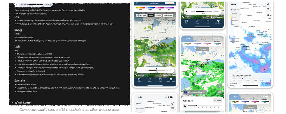
What I learned from studying competitors
To ground my direction, I compared how other weather providers, Apple Weather, The Weather Channel, and Windy, approached similar problems. Each had strengths worth noting, and pitfalls to avoid.
Why Basemap Design Needed a Rethink
One thing became obvious fast: most apps kept their maps simple and subtle. No sharp greens or detailed terrain. The goal was clear: make sure weather data take centre stage.
TWN, however, was still using navigation-style basemaps from Google and Apple, packed with greens, yellows, and details better suited for road maps. The result? Radar often blended into the background. Sometimes you couldn’t even tell where the rain stopped and the land began.
That made the path forward clear: the map shouldn’t steal the spotlight. If clarity was the goal, the basemap had to take a step back and let the weather speak for itself.

Why more options didn’t mean better UX
Then there was Windy… on the opposite end of the spectrum. It offered endless toggles and customizations. Great if you’re tracking barometric pressure in real time, but overwhelming if you just want to know if it’s safe to drive.
Majority of TWN users weren’t power users. They were commuters, parents, everyday people asking: “Do I need an umbrella?” “Is it safe to leave now?” That meant designing for speed, not granularity. They didn’t need complex menus. They needed clear, always-visible controls that delivered answers fast.

Key Takeaway
This research made one thing obvious: clarity mattered more than customization. We didn’t need 20 layers or endless settings. We needed a clean interface that stayed out of the way, kept controls visible, and let the weather speak for itself.
Design
Building Consistency Across Devices
Once the direction felt clear, I began sketching rough ideas to figure out how this could actually work across desktop, iOS, and Android. Where would controls sit? How much space could weather data take without feeling cramped? And most importantly, how do you make this feel like one product across platforms, instead of three stitched-together versions?
I also worked closely with developers early on to test the feasibility of my ideas before they got too far. Sharing these early sketches with the team sparked important conversations. Right away, tough questions came up: How do you keep essential controls visible without cluttering small screens? Where do extra layers and features fit without making the UI overwhelming? These conversations helped me shape a realistic plan that focused on what mattered most and made sure I wasn’t designing in a vacuum.
Timeline Bar: Simple but hard to get right
The timeline was a natural place to start, you know the core control that users interact with to scrub through weather animations like radar or cloud coverage. But getting it right wasn’t easy.
First Attempt: Bottom-Left Timeline Placement
I first tested a small timeline docked in the bottom-left corner of the desktop. It looked clean and freed up space for the map. But once mocked up, it felt awkward. It didn’t scale well on larger monitors, and having a timeline constrained to that small area didn’t feel right. What seemed fine in a small browser window looked weird on wide screens and didn’t give users enough granularity when selecting the time.

Exploration: Gesture Concept That Didn’t Scale Well
I explored a horizontal swipe interaction that mimicked native touch patterns and felt natural for finger-driven control. It was a cleaner, more natural way to scroll through time. It was intuitive, and built around how mobile users already interacted with date pickers. But implementing a different pattern just for mobile raised concerns. Maintaining separate interactions across platforms added complexity, and this one didn’t make the cut.

Final direction: Full-width timeline
Ultimately, we landed on a solution that wasn’t flashy, but worked everywhere. A simple full-width timeline pinned to the bottom became the answer. On desktop, it gave users precise control. On mobile, it felt familiar and easy to tap through. Sometimes the best solution is the one that stays out of the way and just works.

Layer Panel: Balancing Usability and Business Needs
Layers were another balancing act. It was essential that users had quick access to different weather data like radar, wind, and temperature, but the interface shouldn’t dominate the map.
Tried: A Collapsible Panel with Ads
My first concept was a collapsible panel with thumbnails and descriptions that made layers more understandable. It also housed an ad module, which aligned with business needs. But the idea didn’t stick. Stakeholders liked the educational touch, but having ads inside a collapsible UI element wasn’t an option. Monetization had to stay visible.

What Worked: A Right-Aligned Icon Stack That Didn’t Overwhelm
I moved the ad above the main navigation and redesigned the layer control into a vertical stack of icons pinned to the right. This layout made the screen feel cleaner while giving users fast access to high-priority layers like radar, temperature, wind, etc. It kept the core interactions visible without overwhelming the maps. To support future growth without cramming 10–15 layer icons into the UI, I added a “More” drawer that could expand to show additional layers and descriptions when needed.


Tradeoff: Dynamic vs. Consistent Controls
On mobile, I explored a dynamic tray that adapted based on user behaviour, but developers flagged it as too complex for MVP. In the end, we kept the same vertical icon stack across platforms. It wasn’t the most interactive or adaptive idea, but it was clean, consistent, and shipped quickly. For launch, that balance of speed and simplicity was exactly what we needed.
Final direction
In the end, we went with a vertical stack of weather layer icons pinned to the right. It kept the UI minimal, met monetization needs, and worked across all platforms. It met stakeholder needs and gave us a UI that was simple enough to ship without sacrificing usability.
Popup Design: Making Weather Legend Easier to Understand
Some weather data, especially wind and temperature, just isn’t easy to read from colour gradients alone. This was even more painful on mobile, where legends were smaller. To solve this, I designed a simple interaction: users could tap anywhere on the map and see exact values for that point.
How Performance Shaped the Interaction
This subtle detail made a big difference. Instead of decoding colours or guessing, users now got a precise answer with a single tap. But, like much of the project, there were tradeoffs. Showing popups while weather animations played caused major performance hits, particularly with wind particles taxing the system. To avoid this, we limited popups to appear only when the timeline was paused. It wasn’t the most elegant solution, but it struck the right balance between performance and clarity


Launch
What We Prioritized for Launch
The first release was focused. It included radar and cloud layers, a redesigned timeline, and the new Light and Dark basemap styles tuned for clarity. Long-requested features like transparency and speed controls, especially popular on mobile, were left out and queued as fast follows.
Still, this wasn’t just any release. Weather Maps was the first major TWN product to launch with the new design language and React platform. It was more than a redesign… it was a litmus test for whether this new direction could hold up at scale. Not just internally, but with millions of real users.
This wasn’t about cutting corners. Trying to do everything at once would’ve bloated the scope, complicated development, and risked delaying the shift to the new codebase. The priority was clear: get a unified, responsive product into users’ hands, and start learning from real feedback.

Maps
Redesigning the basemap to highlight weather data
Before any weather layers appeared on screen, users were greeted by the map itself. The basemap had to carry a lot of weight, it needed to be readable, neutral, and quietly fade into the background once the data took over.
I designed two new styles from scratch: Light and Dark. Both went through heavy iteration. Early versions leaned too blue and clashed with radar visuals. Through feedback and testing, we shifted to a softer grey palette that let weather layers stand out without overpowering land or water.


What users really missed after launch
But even with all that, something felt off.
The original TWN map had used a terrain-based green style for years. People didn’t just recognize it, they relied on it. Those soft greens and yellows made their neighbourhoods instantly familiar, even if they couldn’t name every road. And once we launched the redesign, the backlash was immediate.
Users didn’t mind the new UI. What they missed was the “green map.” They had built mental models around that, and now it was gone.

What they didn’t know was: I’d seen this coming.
During MVP planning, the Classic map didn’t make the cut. The focus was clarity, simplicity, and speed to launch. But I knew removing something so familiar could backfire. So I kept working on a terrain-style version in the background, just in case. When the feedback poured in, I didn’t scramble, but delivered it quickly.
That moment reminded me that good UX isn’t just about improving what exists. Sometimes, it’s about knowing what not to take away.


Results
How the Redesign Performed in the Real World
The launch didn’t go quietly.
Within days, users made their frustrations clear, the missing green map, lack of transparency controls(on web), and other familiar touches they had come to rely on. But none of it caught us off guard. I had anticipated this, and updates were already in motion. Fast follows filled in feature gaps. Within two weeks, the tone of feedback began to shift.
And so did the numbers. Bounce rates on the map page dropped by nearly 25% compared to the old version. Time spent interacting with the maps increased on web, where it had previously been underused. Repeat visits to the map spiked, and in less than a quarter, Weather Maps climbed to become TWN’s second most-used product.
But the biggest win? Trust. The launch helped validate TWN’s new design language. What started as a challenging redesign became the blueprint for the TWN web redesign.

Final Thoughts
This project was one of the hardest and most rewarding experiences at TWN. Redesigning a core product used by millions meant navigating ambiguity, working without a dedicated PM, and managing tight timelines without compromising user trust.
Without a dedicated PM, ambiguity quickly became part of the job. I stepped up to run weekly design reviews, sync with developers, and push decisions forward. It was awkward at first… senior devs pushed back often, and without formal research, I hesitated to challenge developers when decisions were being made without a clear user perspective. But over time, I learned when to hold my ground. My background in development helped me push back when timelines or technical pushback didn’t quite add up, and turned resistance into collaboration.
And if there’s one lesson that truly stuck: good UX isn’t just about improvement. It’s about designing for progress without erasing what people already understand. That balance is where real trust is built.


