
Weather Assistant
Helping Users Navigate Weather with Dynamic Prompts for a Generative AI-Powered Product

Overview
/Imagine a world where weather forecasts are not just predictions but personalized insights tailored to your needs. Which is exactly what we aimed to accomplish with the innovative Weather Assistant feature, which is the first Generative AI addition to The Weather Network's product suite.
Picture this: you're planning your day, wondering whether you will need an umbrella or sunglasses, and instead of browsing through forecasts, you have a virtual meteorologist at your disposal. This advanced tool was created to change how users engage with weather forecasts and help them understand weather phenomena.
My Role
Responsible for User Research, UI Design, User Feedback analysis
Team
I was the solo designer on this project, collaborating with a Product Manager, and 3 developers
Timeline
1 Month
Summary
As part of the GenAI team, I was tasked with designing a guided prompt feature. Think of it like this: ever get stuck wondering what to ask to an AI assistant? The team and I made it easy by designing and creating a guided prompt feature that suggests questions based on things like the time of day, the weather, or the season. It was all about making sure everyone could get the most out of the Weather Assistant without any hassle.
Goals

Make the Product More Helpful
Design features that make the Weather Assistant easy to use, offering relevant and useful weather information through prompts that match what users need at the moment.

Highlight Product Capabilities
Make it clear to users what the Weather Assistant is for and how they can use it to get the weather details they need, with smooth, easy-to-follow interactions.

Boost User Engagement
Encourage more people to use the feature regularly by creating a personalized experience that makes them want to keep coming back to the product, not just during extreme weather.

Context
Suggested or Custom Questions: What Do Users Prefer?
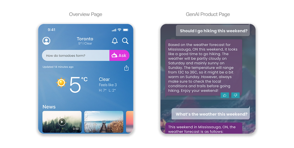
When we launched the weather assistant, one of our primary goals was to help users interact seamlessly with the AI. To achieve this, we implemented a static list of suggested questions that would rotate in the text box, serving a dual purpose. First, these questions would allow users to quickly ask something relevant, saving time. Second, they provided guidance on the types of questions the AI could handle.
This feature was introduced across the GenAI text box on both the overview page and the dedicated AI section of our app and website.

How did the users respond?
A few weeks after the product was launched to beta users, I dove into the user feedback. My goal was to understand how users were interacting with the feature and whether they grasped the intended use cases.
The results were intriguing. Users who engaged with the AI from the overview page seemed to appreciate the convenience of the suggested questions, often choosing to simply tap “Ask” button. In contrast, those who visited the dedicated GenAI product page tended to take a more deliberate approach, typing out their own custom questions. These users were clearly in a more exploratory mindset, having made the time to browse in detail.
That being said, an interesting tidbit I noticed was that a few percent of users just typed the location name in the text box instead of typing a full question. Which made us realize that due to it’s proximity to the current weather info, those users thought that it was a location search bar, and were confused when it didn’t yield the result they expected.
Key Takeaway
The contrast in behaviour between these two user groups highlighted a fascinating distinction: when convenience and speed were key, suggested questions prevailed. But when users had the time and curiosity to explore, they opted for the freedom of crafting their own questions.

Competitive Analysis
How did the other apps solve this?
After analyzing the user metrics, it became clear that a more dynamic, guided prompt feature was essential. Users needed better assistance in planning their day, weekend, or activities.
I turned to competitive analysis to see how other AI platforms approached this challenge. ChatGPT offered an initial prompt on the landing page to guide users, but it didn’t follow up with further prompts after the first interaction.
In contrast, platforms like Bing/CoPilot and Perplexity AI not only suggested initial questions but also offered follow-up prompts. However, Bing's follow-up suggestions left much to be desired... many were repetitive or irrelevant to the initial question’s context.

Crafting Relevant Prompts
The Logic Behind the Suggestions
After gathering user feedback and requirements, our team met with key stakeholders to present our findings. With their approval, we began developing a guided prompt system to enhance user experience. The team product manager and I collaborated to define the logic that would drive the suggestions, ensuring each prompt felt timely and relevant.
To make this happen, we consulted with meteorologists and determined the core factors that would influence the suggested questions. We decided that the following three elements would guide our prompt suggestions:
Core Factors

Time of Day

Weather Condition

Current Season

Why Specifically These Factors?
Now you might wonder “Why are these factors so important?”. Good question. Let’s take one of our prompts, for example: “Best day for a BBQ.” this is a perfect suggestion for spring, summer, and early fall, but imagine showing that in winter or when rain is forecasted all week. It simply wouldn’t make sense. By considering the time, weather, and season, we ensured that the questions we suggested were always relevant to the user’s current context.

Brainstorm
Cross-Platform Collaboration
As we refined the logic behind the suggested prompts, I began sketching early concepts for how this feature would appear on our product, specifically the main landing page of the mobile apps. Since I worked as a cross-platform designer, I took the initiative to lead a brainstorming session with designers from the responsive Web, iOS, and Android teams. The landing page update would impact all platforms, so it was essential to ensure consistency across the board.
Balancing Space and Visibility
One of the key challenges we faced was the instruction from stakeholders to avoid increasing the size of the existing module at the top of the landing page. They didn’t want to push other weather modules down, as this could negatively impact user engagement. At the same time, moving the module lower down the page wasn’t an option either as it was still a new feature, and we needed to build a strong user base first.

Generating and Refining Ideas
During our brainstorming session, each designer contributed solution sketches. We used a shared FigJam board to present, critique, and discuss what we liked and didn’t like about each concept. After a productive session full of great ideas, we narrowed it down to two potential concepts. Ultimately, we leaned toward the second one, as it offered a strong solution for the MVP design and aligned perfectly with user feedback as well as fulfilled the stakeholder requirements.
Concept 1: A Search Bar with a Twist
In one of our early concepts, we considered adding a miniature search button that would expand into a full search bar. This way, users who preferred typing their own questions from the landing page could continue to do so. The guided prompts would be right next to it for users who preferred interacting with the suggested questions.

Concept 2: Guided Prompts Only
The second concept simplified the user experience by focusing solely on the guided prompts, without a search bar. Our research showed that most users preferred the pre-populated questions we had initially implemented.
However, in the original version, some users mistakenly thought the input box was for location search, often typing city names instead of weather-related questions. This concept aimed to eliminate that confusion entirely.

Design
Final Solution
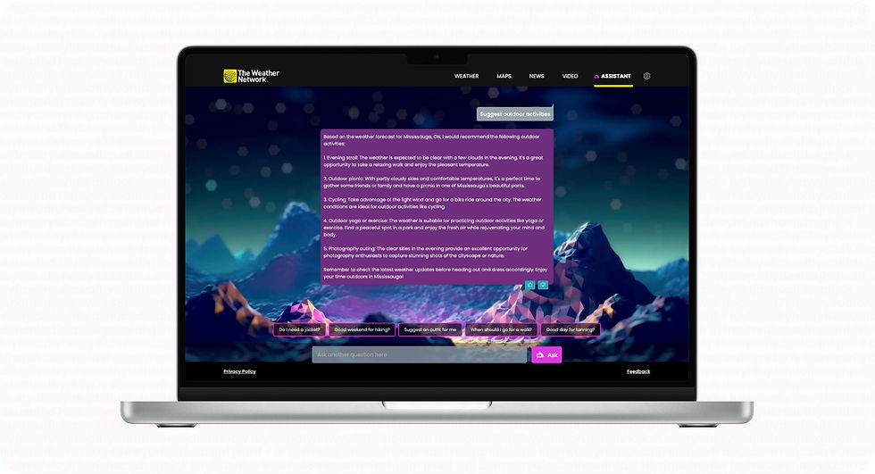
After presenting both concepts, the stakeholders agreed to move forward with the second option, as it was more feasible and aligned with our research findings. For the final design, we decided to limit the number of suggested prompts to under five, ensuring that users wouldn’t be overwhelmed by excessive horizontal scrolling.
One of the key pieces of feedback we received from the MVP version was that the module felt too “in your face,” largely due to the overuse of fuchsia pink, the brand colour we initially chose. In response, we significantly toned down the pink, ensuring the module still caught users' attention without feeling intrusive.


Results
The Perfect Storm (Launch Metrics)
The stars, or rather, the snowflakes, aligned perfectly for our launch. Just as the development team finished bringing the new design to life, a major snowstorm hit parts of Ontario on the very day we rolled out the update. The timing couldn’t have been better. Users immediately flocked to the app, relying on our freshly launched guided prompts feature to stay informed about the storm.
In the days following the storm, we kept a close eye on user behaviour and feedback. The response was overwhelmingly positive. Users loved the ease of use and praised how intuitive the prompts felt. It seemed like we’d struck a chord, but we had to ask ourselves: Was this just a storm-fuelled surge? Would things quiet down once the weather cleared?
Storm's Over, But Engagement Stays High
As anticipated, usage did decrease once the storm passed, but it remained significantly higher than before the update. The data, along with the glowing feedback, made one thing clear: this wasn’t just a temporary boost in engagement. The new feature had genuinely enhanced the user experience, keeping users more engaged and satisfied long after the weather event. Our redesign had successfully hit its mark.

Final Thoughts
This project taught me an invaluable lessons about how generative AI can enhance user experiences by delivering timely, relevant information. While the launch of guided prompts was a success, it’s only the beginning. Future iterations will focus on making the prompts even more detailed and personalized, helping users not only plan their day but anticipate specific needs based on unique weather patterns, and their personal activity preferences such as hiking, dog-walking, etc.
Throughout this project, I deepened my understanding of how generative AI functions and, more importantly, how it can be leveraged to truly assist users. Designing around AI isn’t just about making something technically impressive... it’s about anticipating human needs, guiding interactions, and ultimately making complex information feel accessible and intuitive.
This journey, from researching user behaviour to collaborating with other teams and responding to real-world feedback has reinforced the importance of building adaptable, user-centric designs. As we move forward, the potential for AI-driven features to continuously improve user satisfaction is clear, and I’m excited to be a part of shaping those future experiences.


